Saturday, October 10, 2009

Lots of Calligraphy

* My ongoing calligraphy class has started up. I've been working on material for Shelly Baur Studios including ideas for the piece that will be in the upcoming "Signs and Portents" show.

* I took a great weekend seminar with one of the foremost Spencerian penmen in the world, Michael Sull. It covered much the same materials as this class description. I will use it for some really beautiful capital lettering and pictorial art.

* Finished a beautiful illuminated B with some of the new watercolors from August. Will scan in eventually.

* Trying to file all my calligraphy materials from summer that have accumulated. This take surprisingly long.

Monday, August 31, 2009

Call to Artists: Signs and Portents

My fall calligraphy projects have just been publicly announced!

The CR Gallery will be holding a juried exhibit this December -- Signs and Portents. I'll be doing both the postcard graphics and (hopefully) have a piece in the show.

Click HERE for more information including a call for artists.

Sunday, August 30, 2009

Logo in Roman Capitals

I finished the big logo design in Roman capital lettering on Friday. Scanned and sent it to the graphic designer immediately.

Today, the graphics designer already sent a couple of iterations back for comments from both me and the publisher (my client, who also happens to be my husband).

The Process -- in case you're curious
1. Traced and then drew Romans for a couple of months. Hadn't studying them in depth before so I got some excellent models including ones adapted from the carved Trajan column in Rome.
2. Did lots of thumbnails of possible designs as they came to me. Showed to client at various points.
3. Did several final sketches after I felt like I could really play around with Romans (proportions, spacing, serifs, curves, etc.). Got more direction from client.
4. Got the publisher's approval over the initial draft.
5. I took that design to my calligraphy instructor who made some good weight and spacing suggestions.
6. Redid my design and that's what I sent to the graphic designer, who has more experience with Adobe and graphics than I do. Also, always good to get more professional eyes on a project this big. When finished, the logo will be seen by thousands around the world.

Tuesday, August 25, 2009

L Series Primatek colors

The last in the L series, this one has a fun dot background which turned the overall feel into something more lighthearted than usual.

To complement a more whimsical pattern, I did softer colors in a pastel scheme. This would be perfect for a child, wedding, etc.

The green and pinkish colors are from my new Primatek Daniel Smith watercolors I blogged about earlier this month. They're genuine ground stone.

Rhodalite = pink
Amazonite = green

L Series: Squiggly background

Here's another in the L series. This time, I tried a new background with lots of squiggles. Odd squiggly designs were occasionally used in some of the older manuscripts.

The colors ultramarine, veridian, and cadmium yellow all work for me, but the cadmium red pale is too heavy in real life. I tried toning it down with iridescence and it didn't work, either. Had to apply it extra thick to cover up green underneath, which just looked bad. That's what sometimes happens with experiments.

Saturday, August 22, 2009

3 Cadmium L

I needed some strong colors so the dark ultramarine background wouldn't overpower the L. So, I tried out three different cadmiums -- yellow pale, red pale, and orange.

It actually works better in the scan. Viewed in person, the colors try too hard for attention and look more like a op art piece.

Contrast this with the previous post where I used 2 of the same cadmiums plus placed the lighter color in the background.

Illuminated L with Yellow Checks

Exact same design as the "3-cadmium L", including the checkerboard background. Same colors minus the cadmium orange, just used in different spots. Here, though, the colors pop rather than overwhelm.

It looks a bit washed out in the scan, but in real life I think the colors look balanced. This is why I always end up testing my colors scheme on the scanner if it will be for reproduction in a book or something.

Posted this one a while back, so you can tell I went about 5 months between inking/backgrounds and the final colors for this series of L's.

Sunday, August 16, 2009

My watercolor palette

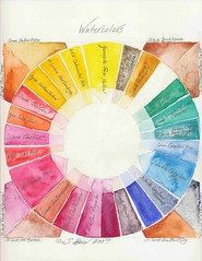
I picked up some new colors for my birthday and finally got a palette that would truly organize my watercolors rather than taking them from the tubes each time I used them.

I can't wait to play with them!

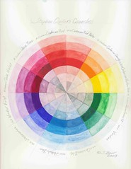
I placed them roughly in a color wheel format, but since I hadn't used a number of these before they're not in the exactly places where I'd put them now that I've really tested them out on paper.

Hodgepodge
My husband kindly gave me my first artist-quality watercolors from his collection. Over the last few years, I've acquired a few as necessary when I did specific calligraphy projects.

Finally, I felt I was doing enough additions of watercolor to my works, especially with transparent stained-glass effects, that I justified taking my birthday money straight to Daniel Smith last week to fill in the gaps. Though it's not the way I'd have acquired them if I were starting out fresh, building a collection a bit at a time eased some of the financial pain.

I tried not to get too many new ones that overlapped with the gouaches I already have. Hence my favorite color, cobalt blue, isn't on here.

NOTE: I'm very lucky to have a Daniel Smith store just a few miles from my home. They're one of the premier art stores in the U.S. and they also make many of their own artist-quality paints.

PrimaTeks
The first new set I picked up are the PrimaTeks, derived from grinding actual stones. Rhodalite (bottom left), Lapis Lazuli (bottom right), Turquoise (upper right) are some of the stunning examples.

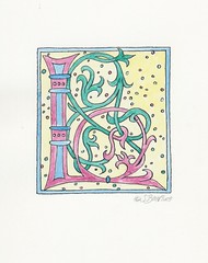
I plan on using these both to make my nature illustrations look more natural and to make my illuminated lettering more historical.

Most of them have a lovely granulating quality (i.e., the pigment settles unevenly so it looks more pebbly). The Purpurite and Sodalite in the bottom right show this off especially well.

Quinacridones
After I put the watercolors into the palette (designed by Stephen Quiller who I mentioned in yesterday's post), I noticed I had very few oranges, reds, pinks, violets, and purples. I decided I'd pick up Daniel Smith's Quinacridone Set.

I felt these colors would liven up a number of my works and wanted some more transparent colors in addition to the mostly granulating qualities of the PrimaTeks.

True Color Wheel
Because it was built in such a hodgepodge fashion, it hasn't been constructed to have exactly complementary matches all around like my gouache palette. (And, I do have more gouaches than just these.)

Since I already have a true color wheel, I felt freer to experiment, choosing new additions that I felt would work in the contemporary updates of historical styles I already do. Especially with the stained glass effects I like so much and that pop in my scanned work.

Saturday, August 15, 2009

Gouache Colorwheel

This year, I've been working on color.

One of the color gurus, Stephen Quiller, has written a some good books including Color Choices.

I had a number of his suggested colors already in my palette, but after reading his book I added the rest. Now I have his complete version of the color wheel, which lets me quickly figure out which colors I want to use for new works.

I found it especially useful when creating, Gift of Water earlier this year. Specifically, my first real use of viridian and phtalo blue were in this piece.

Vibrant Neutrals
Quiller chose his colors to be both the most useful for mixing AND be the closest he could get to true complementary colors. For example, Cadmium Red is the complement to Cerulean Blue.

As you mix these colors across the wheel, they turn into neutral shades with a great deal more depth than they would if you merely shaded one with black. The inner most three rings of my wheel show these neutrals as I gradually mixed more of one color towards the other.

Another neat trick
Gouaches are opaque, but if you apply them in light coats they look more translucent -- like regular watercolors. The other three rings of my color wheel are merely diluting the gouache with more and more water to obtain lighter colors. No tinting the gouache with white.

Full Strength color
The fourth ring (counting in either direction) shows what the gouache looks like at full strength. That's how dark I can get it straight from the tube with only a little water added for even spreading.

Special thanks to Louise Grunewald for discussing Quiller's palette in her workshop that I took last year.

Friday, July 31, 2009

Art Shows

Art Shows
I spent time at two different art shows, the biggest and best being the juried Bellevue ArtFair. Got some ideas for framing, displays, and more. Wish I had time to pitch a tent and do a show, but having a three-year old, I'll just have to put one more item in the "When My Child Goes to School" list.

Productivity
This week, the temperature in my area reached 107 degrees (official temp Redmond, WA), which was the highest I've ever experienced and I believe the highest recorded here. Seattle reached a record-breaking 102/103. My productivity as well as everyone else's nosedived as everyone in the area sought air conditioned public places for a few days.

Today felt more like summer in the Pacific NW. I was able to work more on content for a new website I'm creating with a coding-genius and friend, Anne Trent. Also practiced a bit more on Roman capitals.

Wednesday, July 8, 2009

Prehistoric Artworks

A site you don't think of when you think of art: National Geographic. Yet, here are two great art stories from them:

1. Prehistoric Hand Prints
After analyzing handprints in prehistoric cave paintings, they've discovered that many of them are done by women. Indicating that many of the actual paintings are probably also done by women, which isn't what was commonly taught. The older theory being men coming down and painting hunting figures as part of a religious ritual.

2. North America's Oldest Art
A 13,000-year-old mammoth bone etched with a figure of a mammoth.

Tuesday, July 7, 2009

Calligraphy: Is it Outsider Art?

Christopher Calderhead, a leading calligrapher and editor of Letter Arts Review recently posted a very accessible image-heavy lecture on Calligraphy: Is it Outsider Art?

In it, Calderhead examines how calligraphy is and is not integrated into the larger art community.

Calligraphy: Art or Craft?
One of the frequent discussions I heard in calligraphy circles revolves around this question. Calderhead graphs how he views this, giving calligraphy 3-prongs: fine art, craft, and graphic design. In my mind, I've always combined craft and graphic design, but I can see why he's made them distinct. However, I like how he points out how calligraphy is simultaneously many things, which is how I view it.

While the word, craft, often has some derogatory tones, as in "just a craft", I think of calligraphy in terms of William Morris' Arts and Crafts movement. To me, craft often rises to cultural high points, equally worthy of fine art in both time and money. When I'm addressing envelopes, this is the level I strive for. Ditto for graphic designs I do like logos and book titles.

But to say calligraphy is only a craft leaves out many pieces which hang well on the wall, which are fine art, and can compete with other fine art categories. For instance, the pieces that I've done for the CR Gallery, my illuminations, and some of my card images.

So, I found Christopher's take on the art vs. craft question interesting as well as his general take on engaging the greater art field.

Wednesday, July 1, 2009

Draft for Angela Rockett -- future altar piece

When fellow artist Angela Rockett asked if I could collaborate on an upcoming altar piece, I knew I wanted to push everything else aside to do it.

Firstly, I only had to spend some hours to get a good enough draft, not weeks to get the final result.
Second, I get to be surprised at the end with the final result, seeing what some with Angela's artistic talent will do with my piece makes me very curious to see it. Just like a present!

Here's the draft, which displays some of my working habits, such as using a Westwind calligraphy practice pad for layout and spacing. Also, just trying to play around with tweaks to the same words even in the working draft I sent Angela. Earlier, I had sent her a very rough draft to see how she liked various lettering choices, so this current draft shows a very narrow variation.

The hand I used is a modern variation of Gothic called Fraktur, used more in Germany than in the States. This particular Fraktur is from Friedrich Neugebauer's The Mystic Art of Written Forms. It's a hand I taught myself for another project I did for Angela, the graphics for the ER Gallery show, Out of Darkness, Into Light.

Tuesday, June 30, 2009

Obsolete tools

I find it amusing that as a calligrapher, I use several of the tools that are part of this Museum of Forgotten Art Supplies

Saturday, June 20, 2009

Wedding calligraphy Inner Envelope 2

One of the inner envelopes of wedding calligraphy I just finished this week.

It's Italic script done with a pointed pen. Used a combination of walnut ink and zinc white gouache for the color to match the invites.

Wedding calligraphy Inner Envelope 1

One of the Portuguese names for the wedding calligraphy I just finished this week.

This was one of the inner envelopes.

Wednesday, June 17, 2009

The Newberry Library & the Victorian Naughty Book

One of the delights of going to Chicago was a visit to the Newberry Library and their extensive calligraphy/illumination collection. They're a free-use private library with quite a few restrictions designed to protect their books. One restriction is only allowing you three books at a time, with those brought to you directly by the librarians.

My books arrive!
My first three books arrived with a very cheerful look on the librarian's face. Actually, smiles lit both the librarians' faces since the need to carefully cradle the books is so great that two of them brought the books to me. "Enjoy!" the first librarian said as she laid the books down.

"Wow," I think, "they seem to really love their jobs. Or perhaps they just really like calligraphy."

I take a look at what they gave me. Each book comes with its own padded cradle to keep them from opening fully and damaging the spine. I ask if I need gloves on to handle these. Nope, they were printed material and as long as my hands were clean that was good enough. Mind you, some of the printed books I handled were printed in the 1500s. Others, while later, were full of hand painted illustrations over the block prints.

The Victorian Naughty book
The largest book has a beautiful red leather cover on it with no title. I open it up and find many illustrations of Jane Austen-styled women with a twist -- they were showing an ankle. Or even sometimes a calf. I glance through other pages of the book. While several of the headers were indeed written in the calligraphy style of the time (copperplate), it just wasn't that interesting.

Then I think, "Hmmm....was this really the right book?" I look back at my call numbers, look at the call number of the red book. Nope. The numbers are one off. The original book still beckons, so I resubmit for it.

The same head librarian returns. This time she came with a chagrined look while profusely apologizing as she hands over the one I really ordered. "Oh, I'm so sorry! I hope you weren't offended. It's just that so many people order the Victorian Naughty book, that I just assumed that was the one you wanted when I saw the call number." I assure her that I was somewhat amused.

When I told the story to my husband that evening he mused, "Maybe it would be fun for me to check out the Newberry tomorrow. What was that call number again?"

Tuesday, June 2, 2009

SOLD!

My art in the Gift of Water show has sold! I'm about 99.5% happy and 0.5% disappointed it won't be coming home.

It feels a bit odd knowing that I won't have to go pick it up when the show comes down.

Thursday, May 14, 2009

Kirkland Artist Studio Tour

The local artists host a Mother's Day weekend Kirkland Artists Studio Tour where you can meet them at their homes and buy their art directly. What a treat! I decided this was exactly what I should see on Mother's Day.

Moontoe Gallery
The first studio I loved was Ann Gates Fiser's Moontoe Gallery, which features fantasy art such as fairies. She has such a way with color!

Ann was kind enough to share some printer and card making tips. I realized afterwards that I should have picked up some of her cards, though viewing them online is good, too.

Her husband was there painting a very realistic, contemporary portrait. The technical prowess that goes into portraiture just seems so utterly beyond me. I chose not to focus on his stuff so as not to feel completely unworthy of being an artist.

Elizabeth Kincaid Studio
Next up was another joint husband/wife studio. Larry Andrews programs his art from mathmatical equations and colors them. He shared many great tips on cards and prints, too. And was just fabulously nice.

His wife, Elizabeth Kincaid, is a noted watercolorist who teaches classes in her home studio. She had so many fans who I felt needed to speak to her more than I did that I didn't actually get to talk to her.

If you're interested in watercolors and are local, check her out. Or read her book, <i>Paint Watercolors that Dance with Light</i>, published by Northlight Press.

I was so wrapped up in the art, I forgot to buy cards there, too. I blame the skilled conversation of Larry combined with the killer view of the Cascade Mountains for distracting me.

Others
I went to a few other studios, though none impressed me as much as the previously mentioned artists. Mostly they were interesting to me because of location (near the Lake Washington waterfront) and for seeing how other artists marketed themselves.

I thought I'd be able to see more studios than I did, but it takes time to drive around. Of course, finding two studios with artists willing to talk and share with me took the most time; they were well worth it.

Sunday, May 10, 2009

Letters of Joy conference

Last weekend, I threw myself in the premier Seattle-area calligraphy conference, Letters of Joy.

Friday night featured a slide show by guest of honor Lisa Engelbrecht. Almost as exciting was the silent auction that can really cause me to try to spend too much money. I won some Dover clip-art books for only $10, so I came through relatively unscathed.

Some very good vendors always set up at the show, including a vintage pen/inkwell/nib dealer. To keep my spending in line and to the items I wanted would be shipped, I placed a large order beforehand. I then spent a great deal of willpower staying away from the tables to avoid having my wallet spontaneously combust from all the wonderful supplies and books that I would have wanted to take home.

Class Sessions:
Quills
Saturday opened with a two hour session with one of the D.C. area calligraphers helping us prep and cut our own turkey feather quills. Fun, fun, fun.

Pointed Brush
After that, I had the "good for me" class on pointed brush lettering, which helped internalize many of the hand movements I learned under Carl Rohrs last fall. I have yet to really feel comfortable with brush lettering, and I want to get it under the kind of control and ease I have with the dip pens (both pointed and broad-edged).

Rustics
The final session used a flat brush to letter an old Roman hand, rustics. You can see the hand on the walls of Pompeii -- it was often used for the graffiti.

In Sum:
The many volunteers that work on LoJ deserve only applause. Truly, the only criticism I have of LoJ is that there are too many good classes to take, and not enough sessions to take them in. So, I have to go back again and again and again....

Besides the sessions, it's always wonderful to meet up with all the other calligraphers from around the area, to see the art show, and just to experience the love of paper and pens.

Wednesday, April 8, 2009

Gift of Water: Papyrus

Here's the final piece I just turned over for the "Gift of Water" art show at ER Gallery. I'll be at the April 16th reception, and you're invited to attend if you're near Kenmore, WA. I'll post more details on the reception later.

Art Piece
I used actual papyrus for the surrounding mat. It's attached and I consider it an integral part of the piece.

The glittery bits within "water" really are 23 karat gold. I managed to spill some of the gilding medium (used under the gold), too. Fortunately, I was able to clean up most of the mess though I'm not sure it really came out out of my jeans, which are currently being run through the laundry.

The background colors are Daniel Smith acrylics, which I needed to be waterproof so I could use regular watercolors, gouache, and walnut ink over them for the writing and papyrus image.

Special thanks goes to my instructor, Kathy Barker, for helping me with the final composition. I had initially had one with more height and less width to match the frame I was going to use. Kathy persuaded me to use all the elements in my original but narrow the image. It clearly improved the final result, but also meant I had to go and get an entirely different frame.

Gift of Water: Papyrus

Here's the start of the final piece I just finished for ER Gallery's art show "Gift of Water".

Monday, March 9, 2009

Another fun little project from this weekend


Metallic L low rez
Originally uploaded by shellyinseattle
"Metallic" L

Added iridescent medium to the gouache for a metallic sheen, which doesn't show up that well in a scan.

A fun project from this weekend


Metallic K low rez
Originally uploaded by shellyinseattle
"Metallic" K

Added iridescent medium to the gouache for a metallic sheen, which doesn't show up that well in a scan.

as always, Copyright Shelly Baur 2009

Wednesday, March 4, 2009

For Wolf

It's one of the few gilded pieces I've done (yes, with real transfer gold!) and uncial script.

This was done in class during the Martin Jackson workshop I took earlier this month. I really had to rush to get two pieces done in the time frame.

This piece turned out the best and had other calligraphers (who really know their material) oooing over it. So, it doesn't just look pretty, it's got a very solid calligraphy foundation to even expert eyes.

My instructor helped me professional cut the mat out. The gold is actually paper rather than a second mat.

Guess What I got to buy today?

Clicky Clicky

Spoiler
I'll be working on a project for the Gift of Water gallery show involving papyrus. I bought one each of the light and dark and will see how it works in the piece.

Wednesday, February 25, 2009

Call to Artists: Gift of Water

Angela Rockett is once again curating a juried show at the ER Gallery. this time the theme being "Gift of Water".

Read more details HERE.

Monday, February 23, 2009

Martin Jackson Workshop

A couple of weekends ago, I had the joy of full calligraphy weekend with one of the masters, Martin Jackson. It was divine, but exhausting, especially causing eye fatigue after concentrating so hard for hours at a time.

Uncials
The first day, we concentrated on uncials. The quality of the instruction I've had from my regular instructor, Kathy Barker, showed; when Martin came around to evaluate my work, he declared there was nothing at all wrong. All he could find were some nits and suggest a few alternatives. I, of course, felt very good about my strong lettering.

Good enough, that I only sketched out a final piece of the next day rather than doing more drafts.

Gold
Martin also lead us through the process of gold leafing with the traditional gum ammoniac, a sap gather from Iran. (Previously, I had only used a modern plasticizer as a base.)

We started with the dried sap nuggets, reconstituting them with distilled water and allowed to set overnight. At the start of day 2, Martin showed how he poured it through a couple of pantyhose layers to sift contaminates out.

One time, he found a small black eyelash in his, and it at once humanized the entire gather of the sap nuggets. But this time we found only small pieces of grit and such not.

After we finalized our calligraphy, we applied the gum ammoniac with a feather quill, and allowed it to dry until glossy. To activate it, we breathed through straws and quickly placed the transfer gold down. Burnished. Breathed. More gold. And burnished again.

It turned out so good that it's worth framing. I've since gotten some really top-notch matboard, and my instructor is helping me archivally mat the piece with some very wide margins around it. I'll load the pic later.

Sidenotes
By now I know most of the calligraphers in the area, at least the ones who show up in public. So it was a great social event during lunchtime, as everyone shared calligraphy stories.

Blog readers may recall that I went to Molly Hashimoto's demo last month. Well, this time she was one of the students, and I got to tell her how much I appreciated seeing her journals.

Wednesday, January 28, 2009

Arabian Nights Title Pg low res

About a year ago, I did the title and author names for Open Design's Six Arabian Nights project.

This is a stretched out hand called, "Legend", which has the sense of drawn-out swoopiness you find in Arabic writing.

Compare this to the Carolingian from the last two posts, and you'll note both have squat, drawn out shapes to their letters. So you can see how this hand was developed from the older form.

Copyright Open Design 2008.

Tuesday, January 27, 2009

Carolingian Practice 2 low res

After a week of practicing, you can seem my ability to write in Carolingian has improved quite a bit. Some good things here, like "wonderment" at the bottom right.

There's still some experimentation, but that's true even when I know a hand well

I like trying out different ways to write letters to see what works best for a particular project. But I always try to maintain good lettering practices like consistency, etc, or at least knowing why I am breaking the "rule" for a particular point.

General Points
** Dating your work like I have allows you to see how much you've progressed. However, I don't keep many of these pieces due to sheer volume. If you did keep them, you could cut them up and use them for collage elements or bookbinding.

** If you're just learning a hand and are writing with letter families (see post from 1/26/09), then exercise your brain trying to come up with words with just those letters.

Other brain expanding options: words that begin with particular letters, words with many different letters. Or just use pangrams like, "The quick brown fox jumped over the lazy dog."

Copyright 2009 Shelly Baur.

Monday, January 26, 2009

Carolingian Practice 1 low res

I'm learning a new hand, Carolingian, that was developed and popularized under Charlemagne the Great.

Here's my very first page of practicing.

Not that I can imagine people swiping this particular "piece", but copyright Shelly Baur 2009.

Tips for learning a new hand
Since many of you have fountain pens, you can learn to write with this font. Of course, any chisel-edge will do including markers.

1. Start off just trying to do basic marks with the correct pen angle. Note the squares in the upper left corner. Then the swooshes then the circles.

Carolingian mostly adheres to a 20 degree angle. So these practices help you get used to writing at 20 degrees, plus learn to make some of the basic lines/curves of the hand.

2. After you have the basic pen angle down, try to draw your lines at the writing angle. Carolingian tilts at a 5 degree angle from a straight line. You can see me start working on this with the line of l's I did.

3. Add in letters. My instructor believes starting with lettering "families" makes things easier in the beginning. So all the letters that are based on "o" like c and e are practiced, and so on.

4. Then add in words to get good spacing both between letters and between words.

5. I find that tracing a practice sheet using the same sized pen gives me the muscular coordination to do lettering much, much faster than if I try to duplicate a sheet from just looking at an exemplar. So, this example is done on good tracing paper.

Sunday, January 18, 2009

Dayglow Supernova L

Copyright Shelly Baur 2009

Taking my husband Wolf's suggestion to push the color scheme all the way to day glo. (At least, as far as I could easily do with my current color palette.)

decorated k's

Copyright Shelly Baur 2009

Results of the the gouache color test I posted about in the last entry.

* Upper left: Color scheme that's more in line with William Morris and the Arts and Craft movement. Cadmium yellow shade, pearl gold, with the green and purple both custom mixes. Violet shades weren't developed until the Victorian era when a chemist processed them from coal tar.

* Upper right: Traditional colors including cobalt blue, cadmium red/alizarin crimson mix, brilliant gold, and a shade of cadmium yellow.

* Lower right: Traditionally, the royal colors of purple and gold were used for premier book projects. I tried the gold both on the white background and on top of a red base to see the comparisons. Other than the pearl gold, everything else is a mixed color

* Lower left: Cerulean blue, sap green, cadmium red, and a shade of cadmium yellow. Came out looking like acid house colors almost. Wolf thinks I should just push things all the way with the day-glo colors and see what I come up with.

Gouaches used were artist's quality Windsor & Newton's. Except for the golds, which were Schmincke.

Saturday, January 17, 2009

gouache color test

Copyright Shelly Baur 2009

Inspired by a new color book I received recently, I tried out a number of gouache colors trying to be a bit bolder in color schemes.

I tend to use my favorite colors like cobalt blue and wanted to force myself to play a bit more with ones like cerulean blue and some colors I mixed from primaries.

Friday, January 16, 2009

Art Show

My Piece, Light, is currently hanging in the ER Gallery. More info here: http://redeemer-kenmore.org/artsblog/2008/12/05/out-of-darkness-artist-shelly-baur/

It was part of the promotional postcard calligraphy used for the show, Out of Darkness (Into Light), curated by artist Angela Rockett.