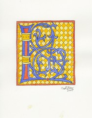
Exact same design as the "3-cadmium L", including the checkerboard background. Same colors minus the cadmium orange, just used in different spots. Here, though, the colors pop rather than overwhelm.
It looks a bit washed out in the scan, but in real life I think the colors look balanced. This is why I always end up testing my colors scheme on the scanner if it will be for reproduction in a book or something.
Posted this one a while back, so you can tell I went about 5 months between inking/backgrounds and the final colors for this series of L's.


Work complete on the Parish Hall window wall
2 years ago

No comments:
Post a Comment