Copyright Shelly Baur 2009
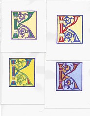
Results of the the gouache color test I posted about in the last entry.
* Upper left: Color scheme that's more in line with William Morris and the Arts and Craft movement. Cadmium yellow shade, pearl gold, with the green and purple both custom mixes. Violet shades weren't developed until the Victorian era when a chemist processed them from coal tar.
* Upper right: Traditional colors including cobalt blue, cadmium red/alizarin crimson mix, brilliant gold, and a shade of cadmium yellow.
* Lower right: Traditionally, the royal colors of purple and gold were used for premier book projects. I tried the gold both on the white background and on top of a red base to see the comparisons. Other than the pearl gold, everything else is a mixed color
* Lower left: Cerulean blue, sap green, cadmium red, and a shade of cadmium yellow. Came out looking like acid house colors almost. Wolf thinks I should just push things all the way with the day-glo colors and see what I come up with.
Gouaches used were artist's quality Windsor & Newton's. Except for the golds, which were Schmincke.


Work complete on the Parish Hall window wall
2 years ago

No comments:
Post a Comment