This year, I've been working on color.
One of the color gurus, Stephen Quiller, has written a some good books including Color Choices.
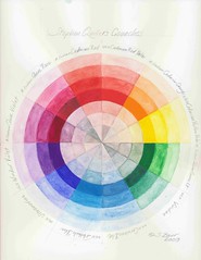
I had a number of his suggested colors already in my palette, but after reading his book I added the rest. Now I have his complete version of the color wheel, which lets me quickly figure out which colors I want to use for new works.
I found it especially useful when creating, Gift of Water earlier this year. Specifically, my first real use of viridian and phtalo blue were in this piece.
Vibrant Neutrals
Quiller chose his colors to be both the most useful for mixing AND be the closest he could get to true complementary colors. For example, Cadmium Red is the complement to Cerulean Blue.
As you mix these colors across the wheel, they turn into neutral shades with a great deal more depth than they would if you merely shaded one with black. The inner most three rings of my wheel show these neutrals as I gradually mixed more of one color towards the other.
Another neat trick
Gouaches are opaque, but if you apply them in light coats they look more translucent -- like regular watercolors. The other three rings of my color wheel are merely diluting the gouache with more and more water to obtain lighter colors. No tinting the gouache with white.
Full Strength color
The fourth ring (counting in either direction) shows what the gouache looks like at full strength. That's how dark I can get it straight from the tube with only a little water added for even spreading.
Special thanks to Louise Grunewald for discussing Quiller's palette in her workshop that I took last year.


Work complete on the Parish Hall window wall
2 years ago

No comments:
Post a Comment