Saturday, October 10, 2009

Lots of Calligraphy

* My ongoing calligraphy class has started up. I've been working on material for Shelly Baur Studios including ideas for the piece that will be in the upcoming "Signs and Portents" show.

* I took a great weekend seminar with one of the foremost Spencerian penmen in the world, Michael Sull. It covered much the same materials as this class description. I will use it for some really beautiful capital lettering and pictorial art.

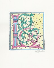
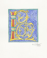
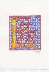
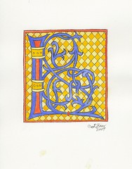
* Finished a beautiful illuminated B with some of the new watercolors from August. Will scan in eventually.

* Trying to file all my calligraphy materials from summer that have accumulated. This take surprisingly long.

Monday, August 31, 2009

Call to Artists: Signs and Portents

My fall calligraphy projects have just been publicly announced!

The CR Gallery will be holding a juried exhibit this December -- Signs and Portents. I'll be doing both the postcard graphics and (hopefully) have a piece in the show.

Click HERE for more information including a call for artists.

Sunday, August 30, 2009

Logo in Roman Capitals

I finished the big logo design in Roman capital lettering on Friday. Scanned and sent it to the graphic designer immediately.

Today, the graphics designer already sent a couple of iterations back for comments from both me and the publisher (my client, who also happens to be my husband).

The Process -- in case you're curious
1. Traced and then drew Romans for a couple of months. Hadn't studying them in depth before so I got some excellent models including ones adapted from the carved Trajan column in Rome.
2. Did lots of thumbnails of possible designs as they came to me. Showed to client at various points.
3. Did several final sketches after I felt like I could really play around with Romans (proportions, spacing, serifs, curves, etc.). Got more direction from client.
4. Got the publisher's approval over the initial draft.
5. I took that design to my calligraphy instructor who made some good weight and spacing suggestions.
6. Redid my design and that's what I sent to the graphic designer, who has more experience with Adobe and graphics than I do. Also, always good to get more professional eyes on a project this big. When finished, the logo will be seen by thousands around the world.

Tuesday, August 25, 2009

L Series Primatek colors

The last in the L series, this one has a fun dot background which turned the overall feel into something more lighthearted than usual.

To complement a more whimsical pattern, I did softer colors in a pastel scheme. This would be perfect for a child, wedding, etc.

The green and pinkish colors are from my new Primatek Daniel Smith watercolors I blogged about earlier this month. They're genuine ground stone.

Rhodalite = pink
Amazonite = green

L Series: Squiggly background

Here's another in the L series. This time, I tried a new background with lots of squiggles. Odd squiggly designs were occasionally used in some of the older manuscripts.

The colors ultramarine, veridian, and cadmium yellow all work for me, but the cadmium red pale is too heavy in real life. I tried toning it down with iridescence and it didn't work, either. Had to apply it extra thick to cover up green underneath, which just looked bad. That's what sometimes happens with experiments.

Saturday, August 22, 2009

3 Cadmium L

I needed some strong colors so the dark ultramarine background wouldn't overpower the L. So, I tried out three different cadmiums -- yellow pale, red pale, and orange.

It actually works better in the scan. Viewed in person, the colors try too hard for attention and look more like a op art piece.

Contrast this with the previous post where I used 2 of the same cadmiums plus placed the lighter color in the background.

Illuminated L with Yellow Checks

Exact same design as the "3-cadmium L", including the checkerboard background. Same colors minus the cadmium orange, just used in different spots. Here, though, the colors pop rather than overwhelm.

It looks a bit washed out in the scan, but in real life I think the colors look balanced. This is why I always end up testing my colors scheme on the scanner if it will be for reproduction in a book or something.

Posted this one a while back, so you can tell I went about 5 months between inking/backgrounds and the final colors for this series of L's.